# ACF - Data Types
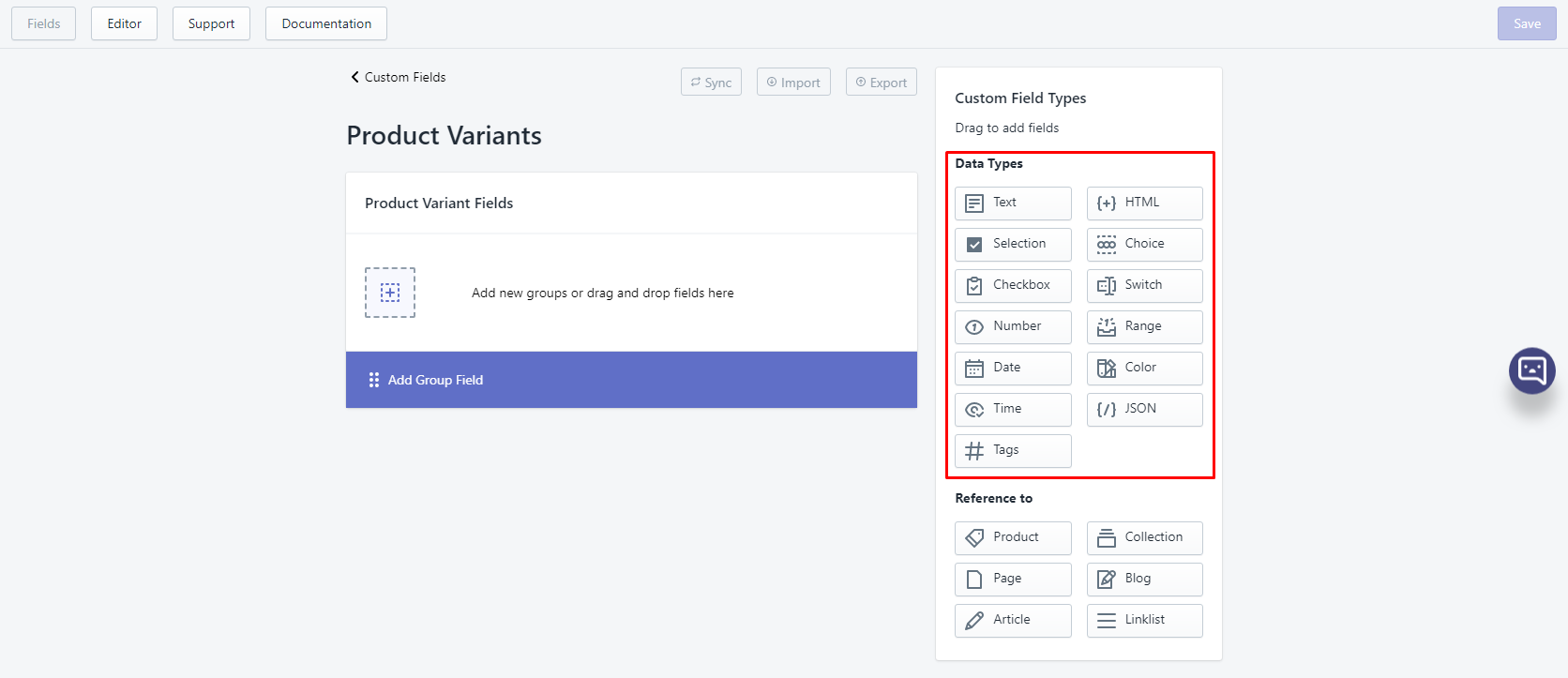
There are 13 data types in ACF. All value produced by ACF is either in string/integer (non-repeatable field) or JSON string (repeatable field).
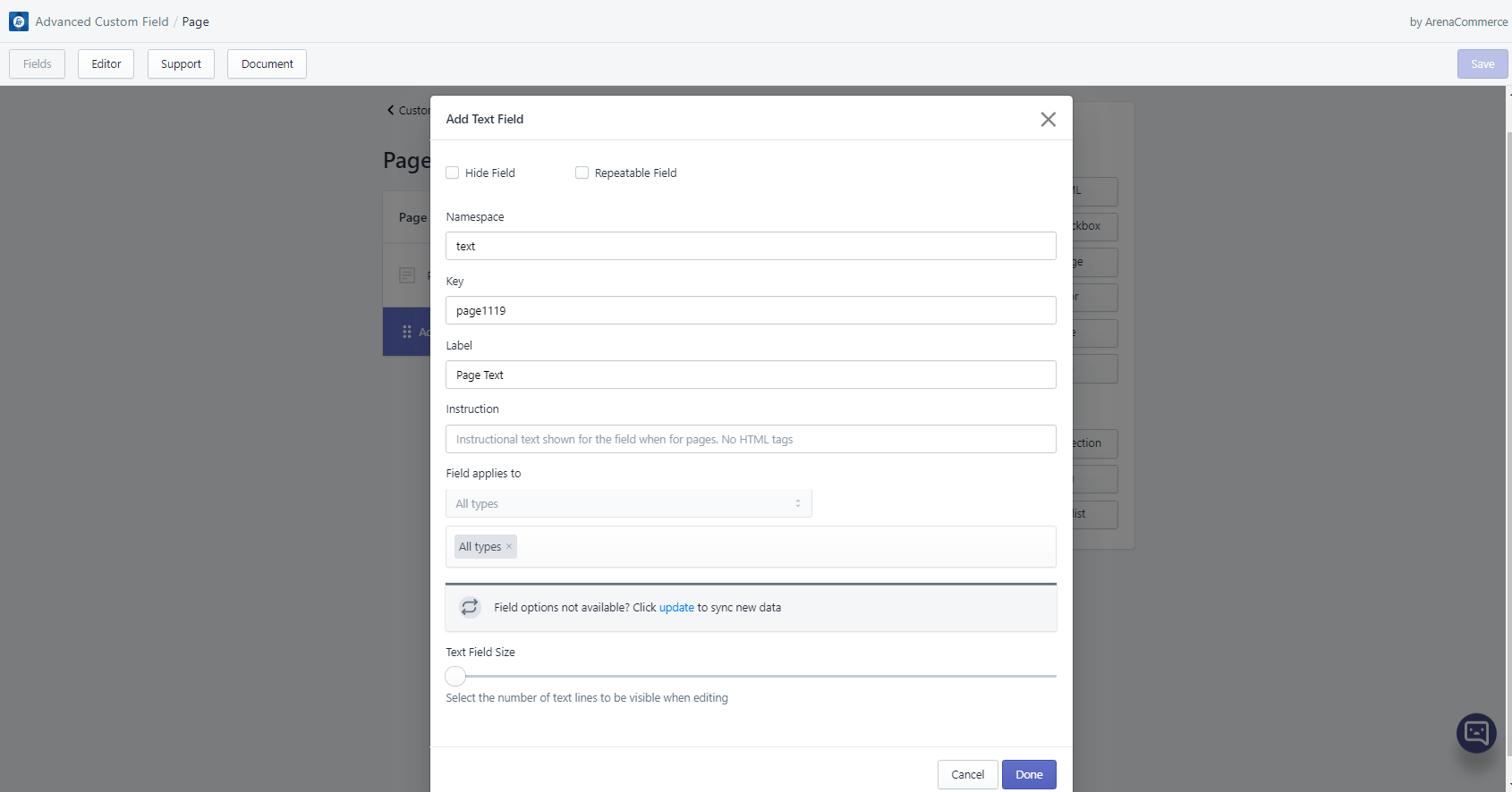
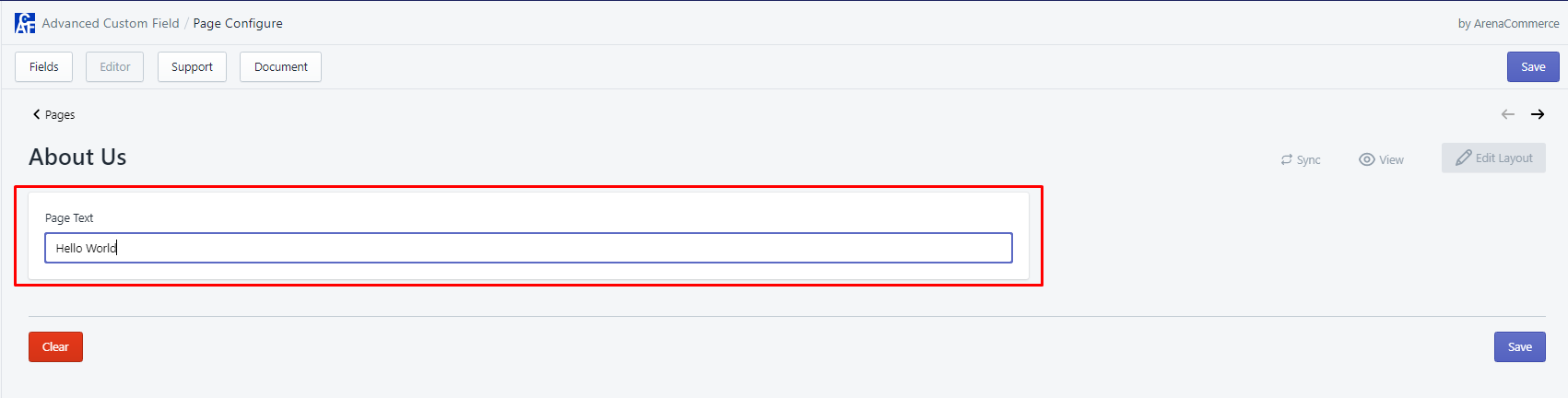
# 1. Text
- Text field helps users to add text content.
- Text field can be adjusted up to 10 lines.
- Text field can be edited in Editor tab via text field editor.
- Template usage example:
<h2>My new heading</h2><p>{{ order.metafields.namespace.key }}</p>
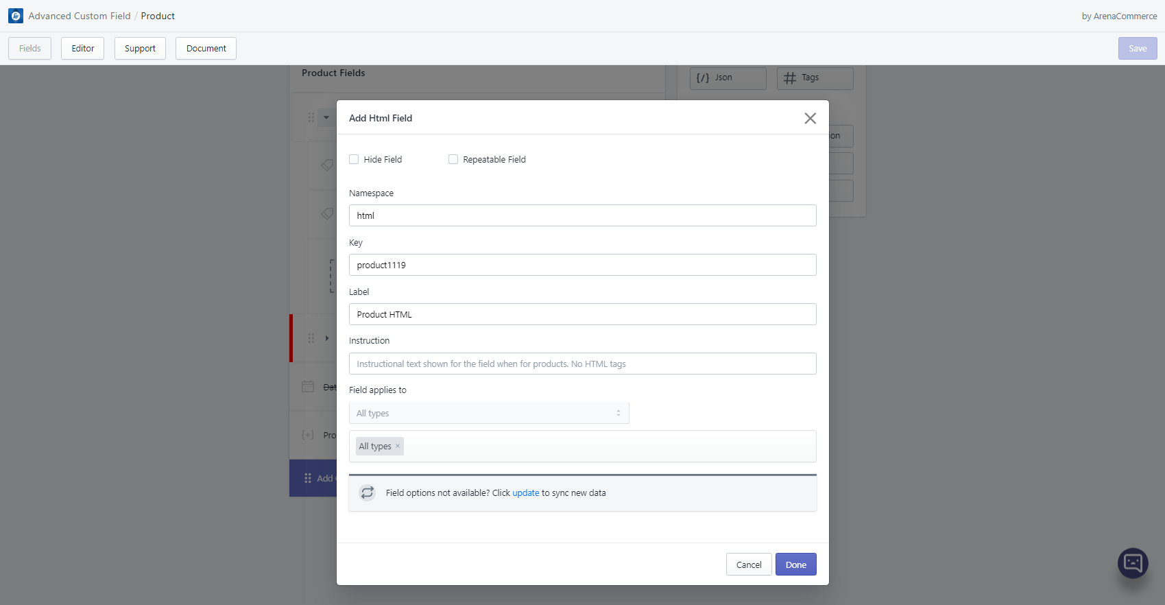
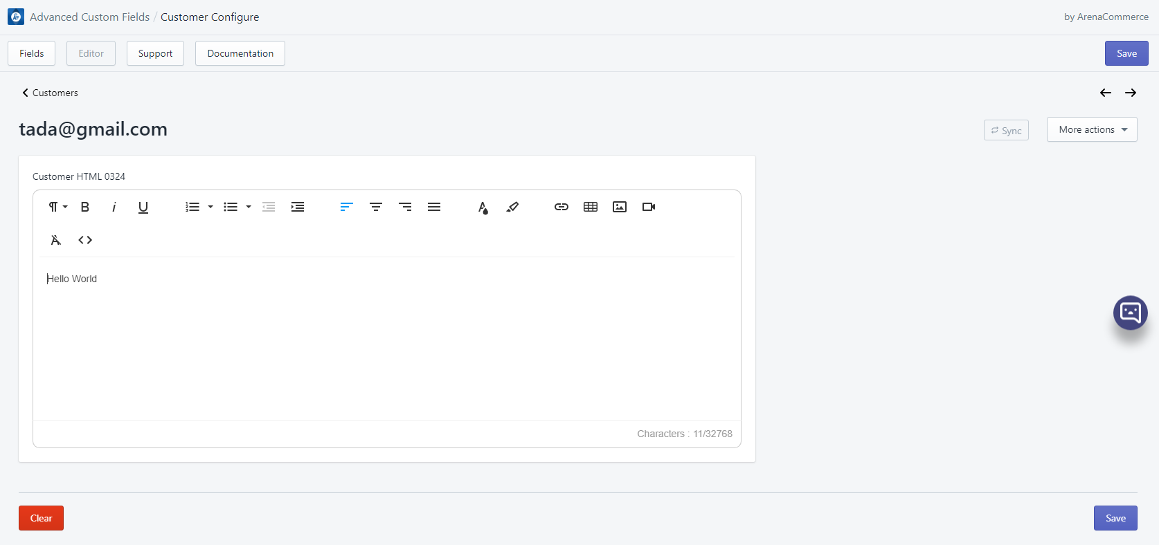
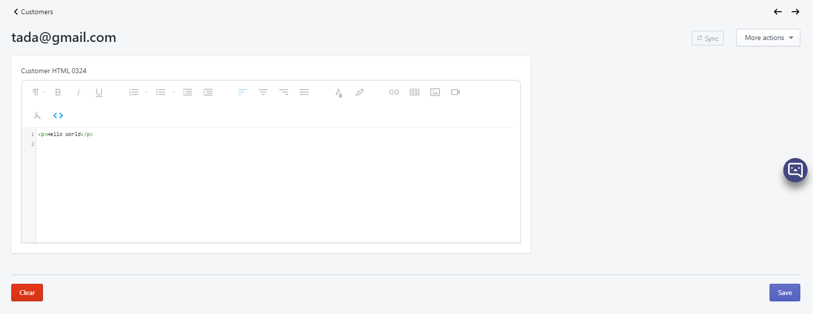
# 2. HTML
- HTML field is like text field but more advanced. Users can add not only text but also HTML content.
- HTML field can be edited in Editor tab via text field editor.
- Template usage example:
<div class="metafield-bullet-points">{{product.metafields.namespace.key}}</div>
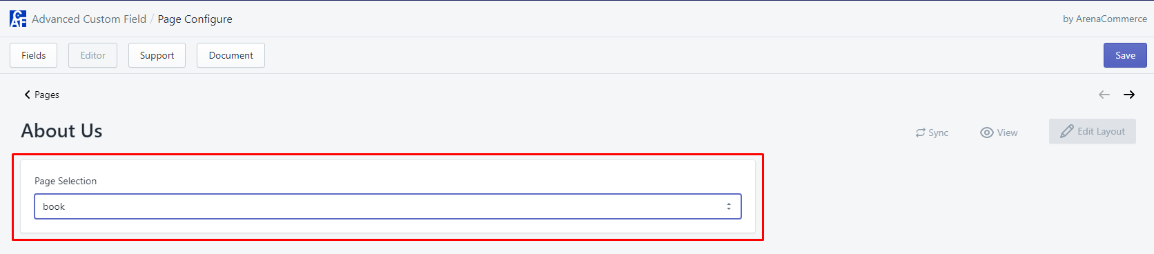
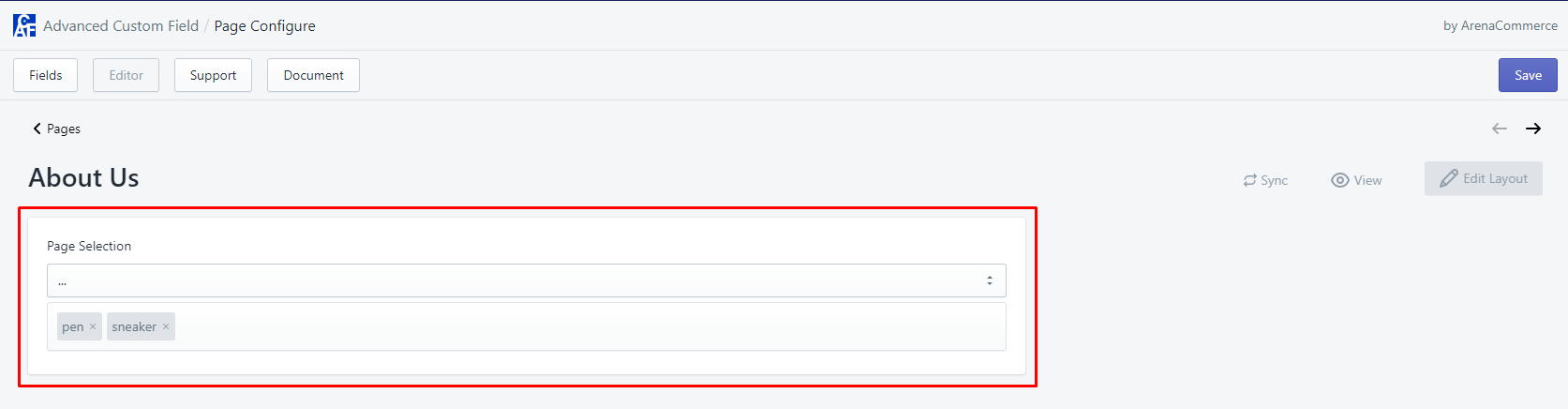
# 3. Selection
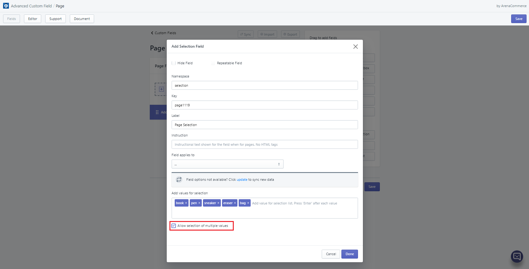
Selection field lets users select one or multiple pre-defined value.
When attribute “Allow selection of multiple values” is checked, each value will be separated by |, for example: hello|world|2020, book|shoes|pen|eraser.
Selection field can be edited in Editor tab via selection field editor.
- Single-value selection:
- Multiple-value selection:
Template usage example:
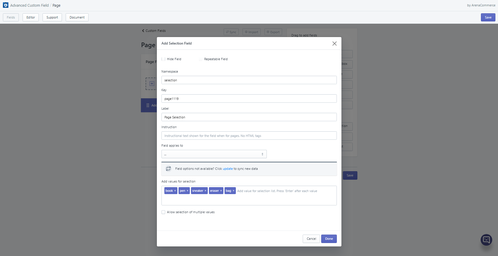
<p>Included item is {{product.metafields.namespace.key}}.</p>
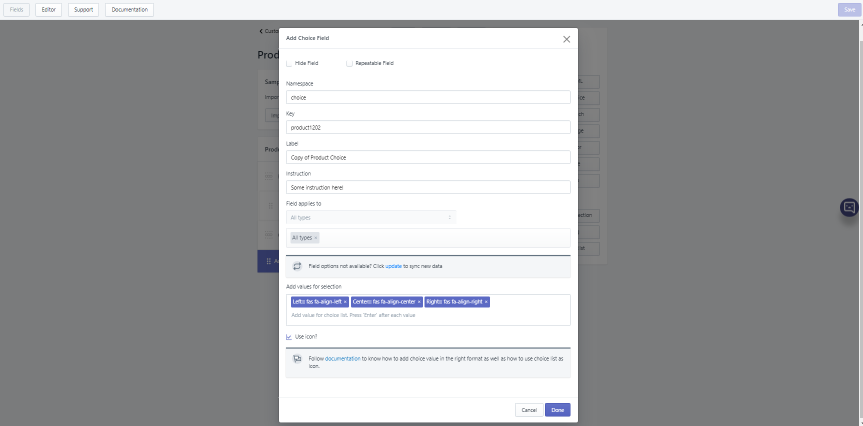
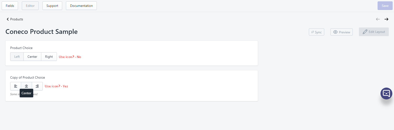
# 4. Choice
- Choice field lets user select one pre-defined value.
- When attribute “Use icon?” is checked, inputted value must be in format
Choice label::: icon's class namein order to display icons. More info please go to Fields tab, article 3. Choice field. - Choice field can be edited in Editor tab via choice field editor
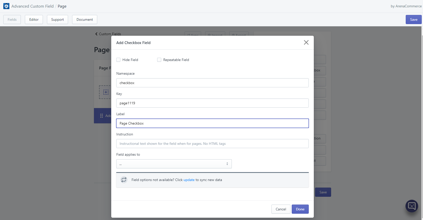
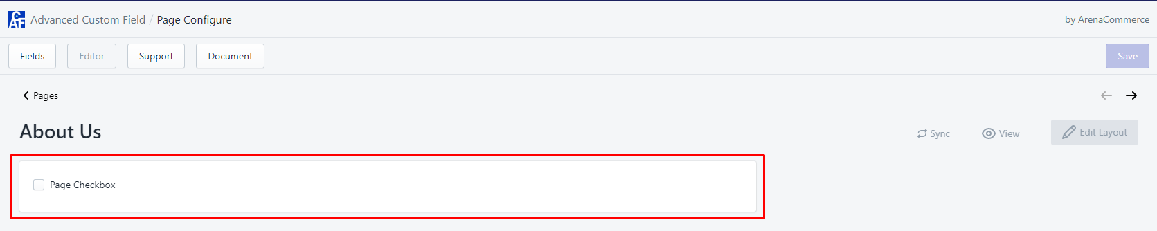
# 5. Checkbox
- Checkbox field is used as a way to have users indicate they agree to specific terms, services or to make simple selection like true-false, yes-no etc. Value created by Checkbox field is boolean (true/false).
- Checkbox field can be edited in Editor tab via checkbox field editor.
- Template usage example:
{% if product.metafields.namespace.key %}
  <p>This product is recyclable</p>
  {% else %}
  <p>This product is not recyclable</p>
{% endif %}
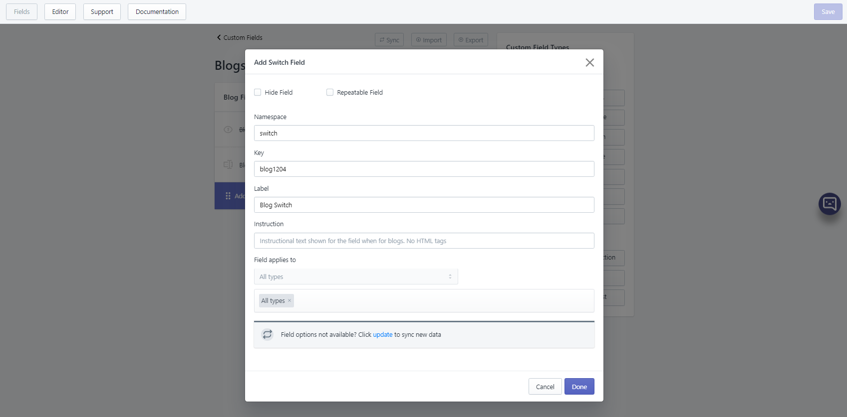
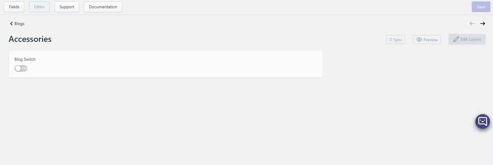
# 6. Switch
- Switch field lets user switch on or off an option. It can also be used to make simple selection like true-false, yes-no. Value created by Switch field is integer (1/0).
- Switch field can be edited in Editor tab via checkbox field editor.
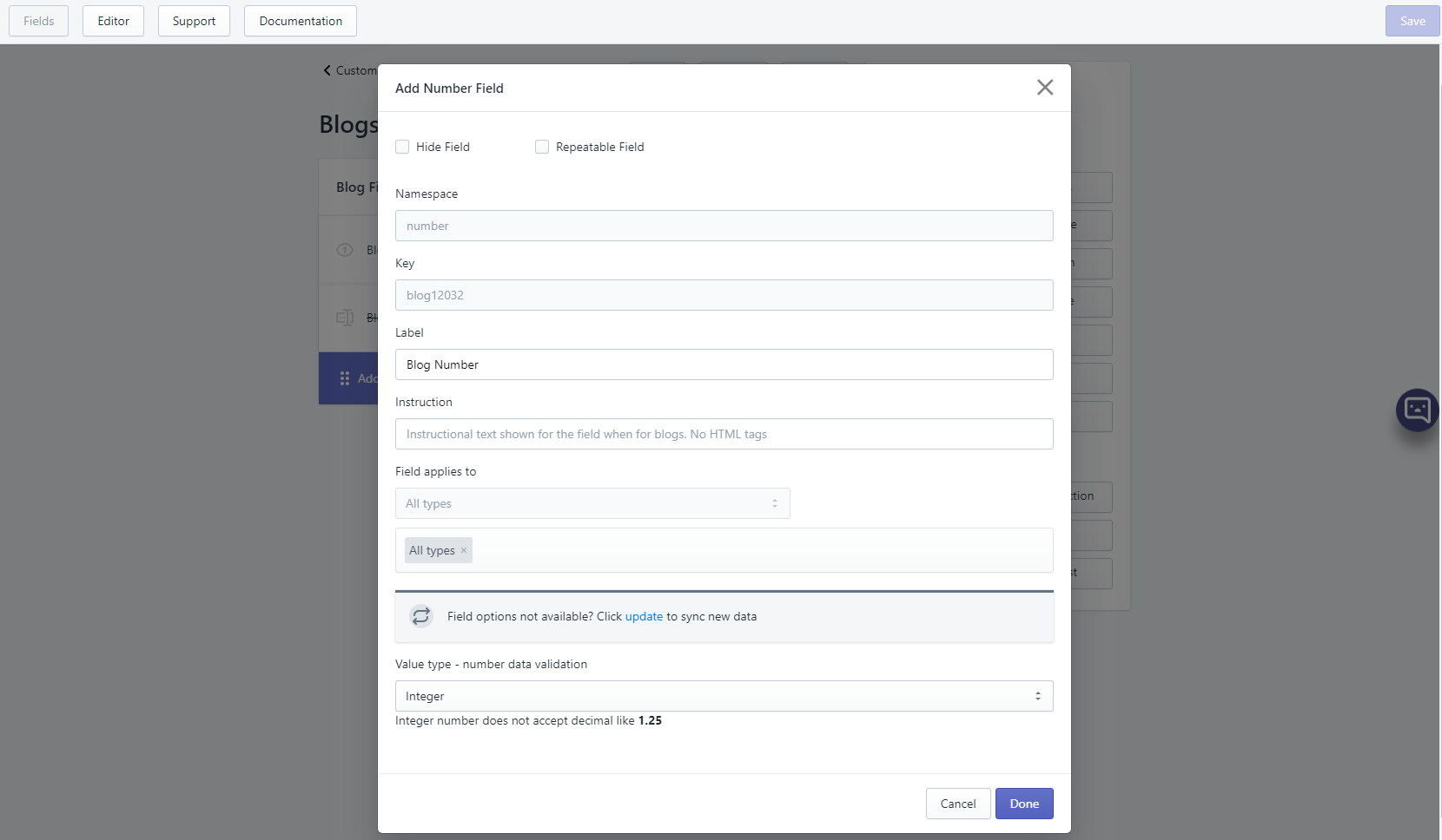
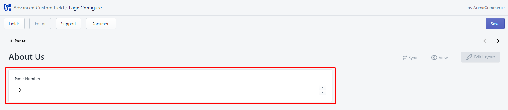
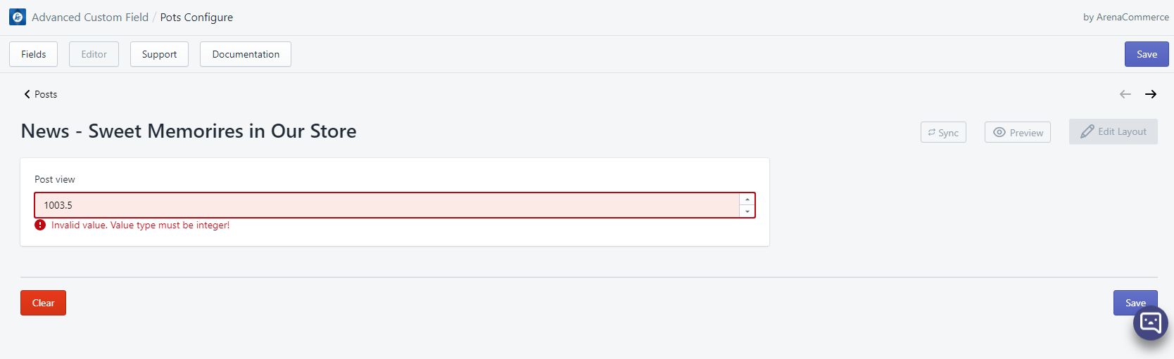
# 7. Number
- Number field helps users to add number only.
- Depend on pre-defined number’s value type in settings, value created by Number can be either string or integer. However, if field is set to be repeatable, value type will be converted to JSON string.
- Number field can be edited in Editor tab via number field editor.
- If Number’s value type is set as integer, the number field editor will not accept decimal and will pop up an error if decimal is inputted:
- Template usage example:
<div class="total-view"><h5>Total view(s): <span style="font-weight: 100;">{{article.metafields.namespace.key}}</span></h5></div>
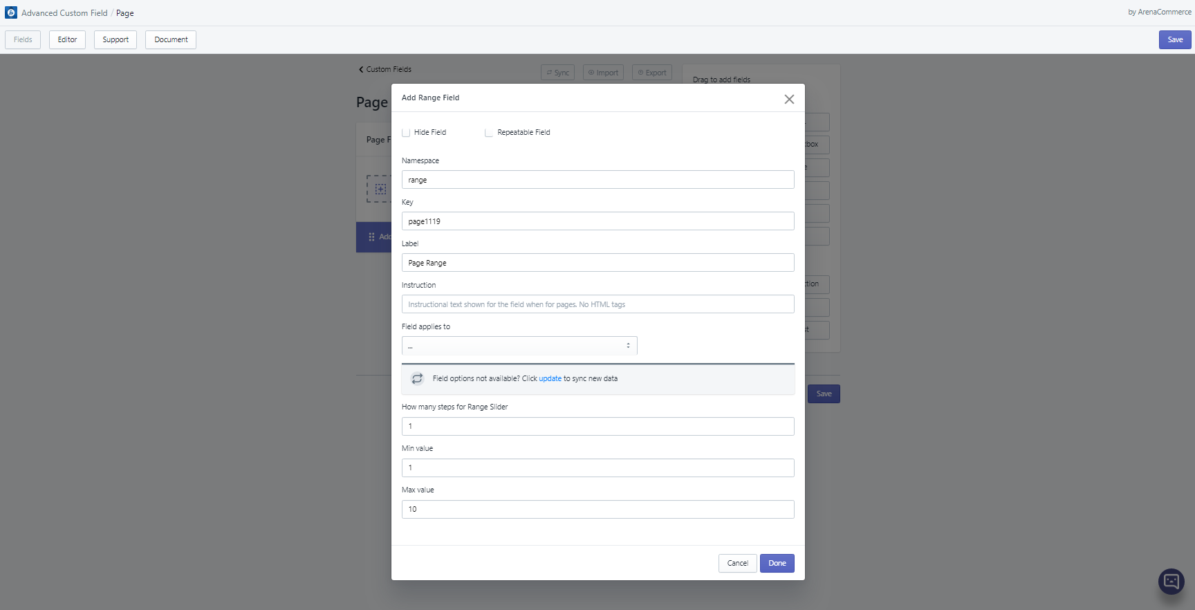
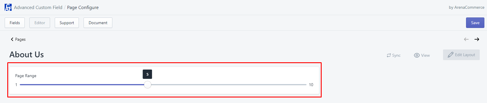
# 8. Range
- Range field allows users to select a numeric value within a given range (minimum and maximum values).
- Range field can be edited in Editor tab via range slider.
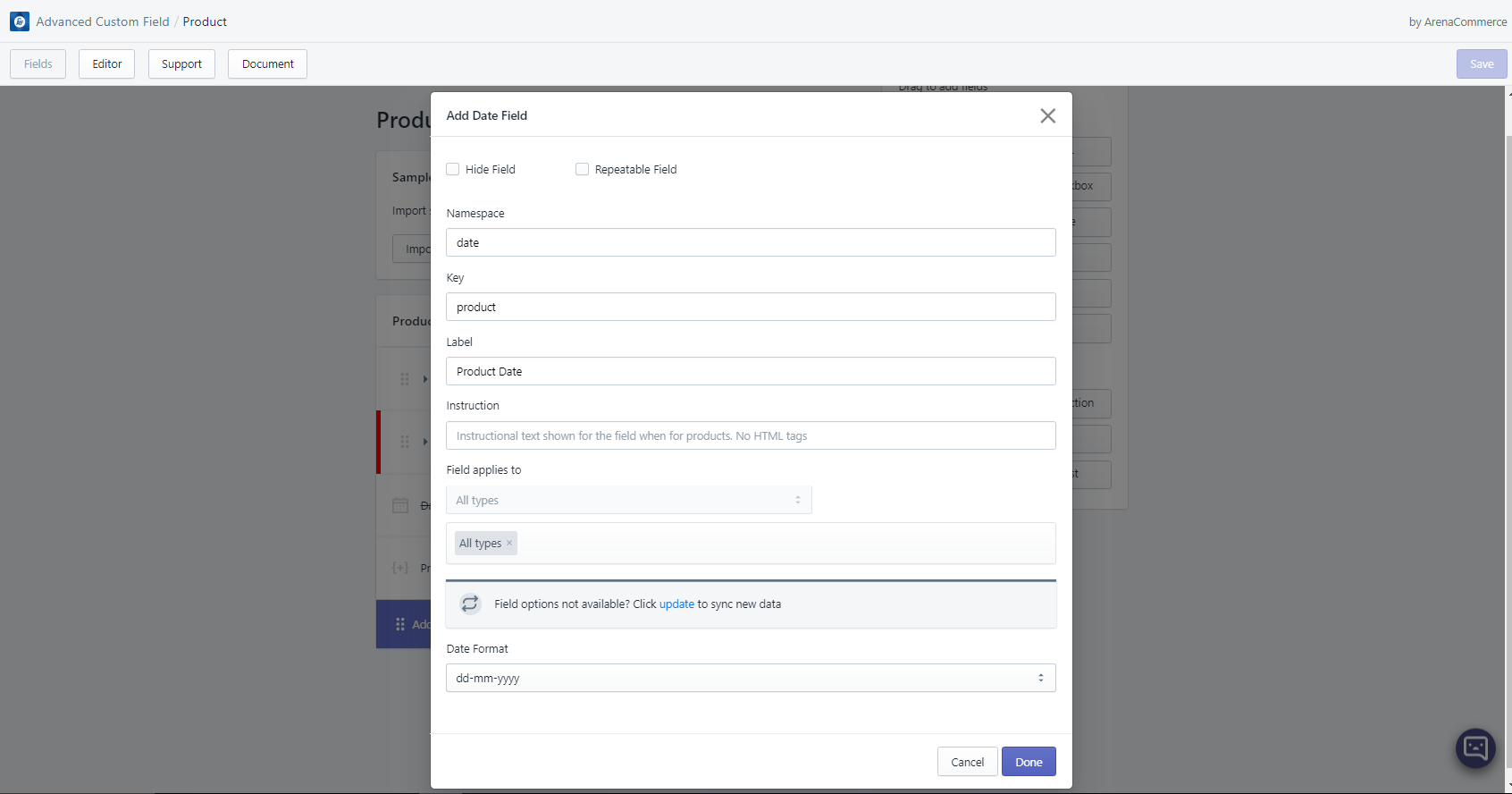
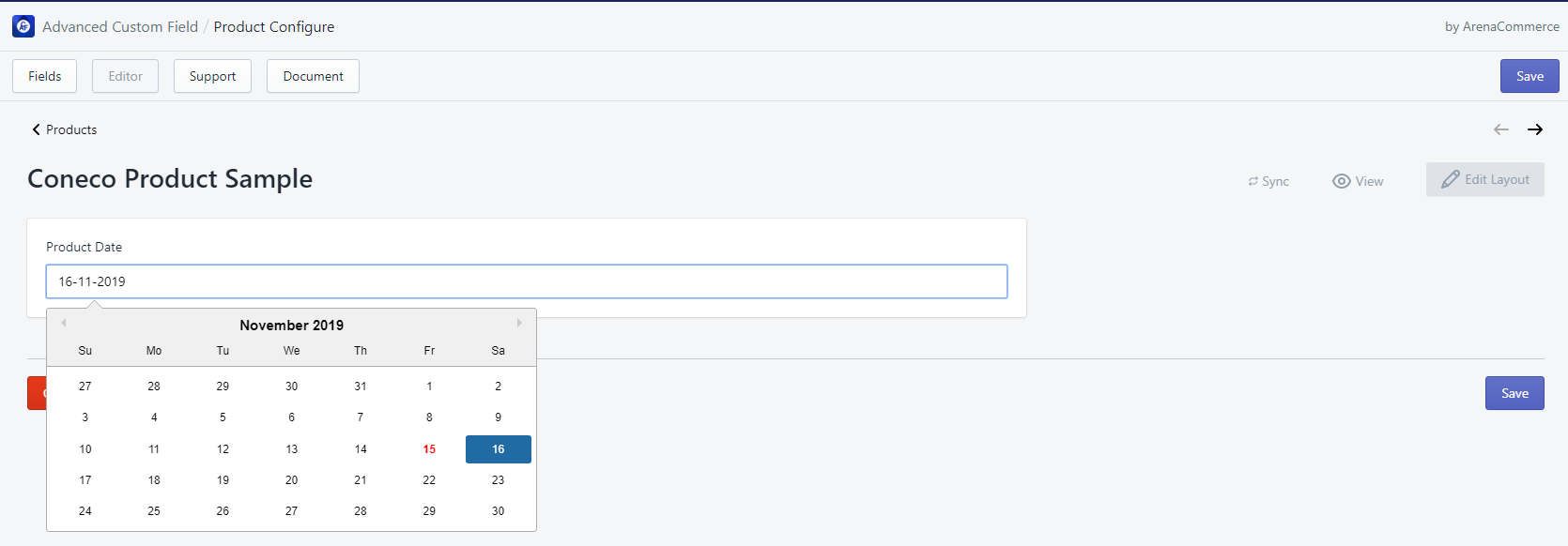
# 9. Date
- Date field allows users to set date for specific events, occasions, activities etc. based on pre-defined date format.
- Date field can be edited in Editor tab via text field editor or date picker. Date picker is synced with the text input field, so users only need to use one of them to add a date.
- Template usage example:
<div class="sale-expired-date page-width" style="text-align: center; font-size: 50px;">Hurry up! Sale will end on {{collection.metafields.namespace.key}}!!</div>
{% endif %}
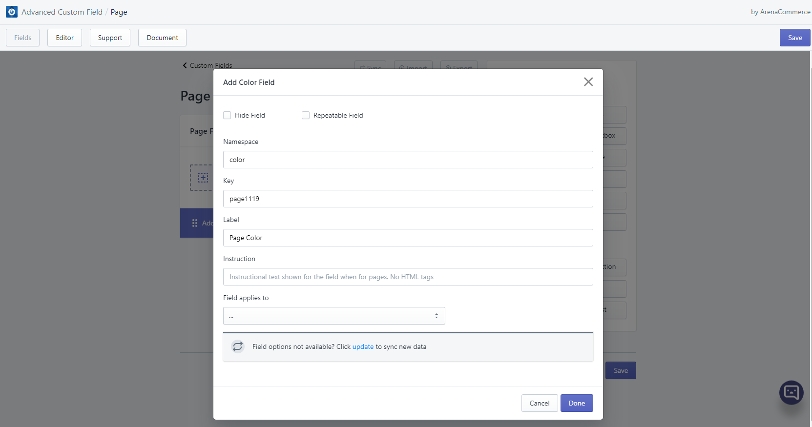
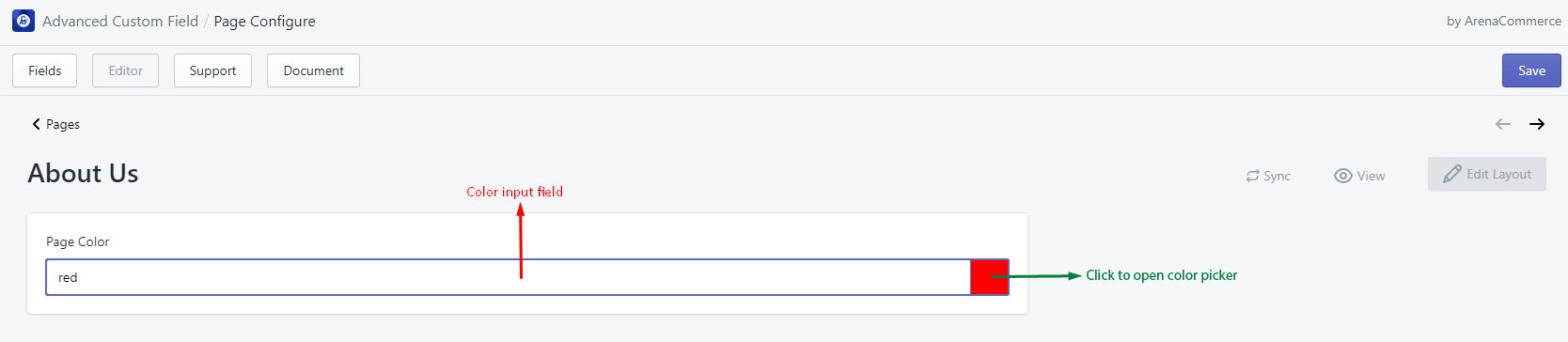
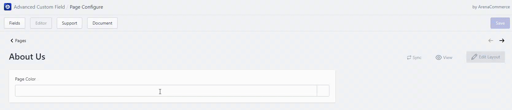
# 10. Color
- Color field allows users to add HTML color names, color hex codes, color rgb codes or color rgba codes.
- Color field can be edited in Editor tab via text input field or color picker. Color picker is synced with the text input field, so users only need to use one of them to add a color.
- Template usage example:
{%- if item.product.metafields.namespace.key != blank -%}
  <li class="product-details__item product-details__item--wp-color">Wrapping paper's color: <span title="{{ item.product.metafields.namespace.key }}" style="height: 20px; width: 20px; display: inline-flex; vertical-align: bottom; background-color:{{ item.product.metafields.namespace.key }}"></span></li>
{%- endif -%}
# 11. Image/File
- Image/File field allows users to add image URL.
- Image/File field can be edited in Editor tab via text input field.
- Template usage example:
{%- unless product.metafields.namespace.key == blank -%}
  	<div class="custom-field--content product-custom-field--image-size-chart">
  		<img src="{{product.metafields.namespace.key}}" alt="size_chart_customfield">
  	</div
{%- endunless -%}
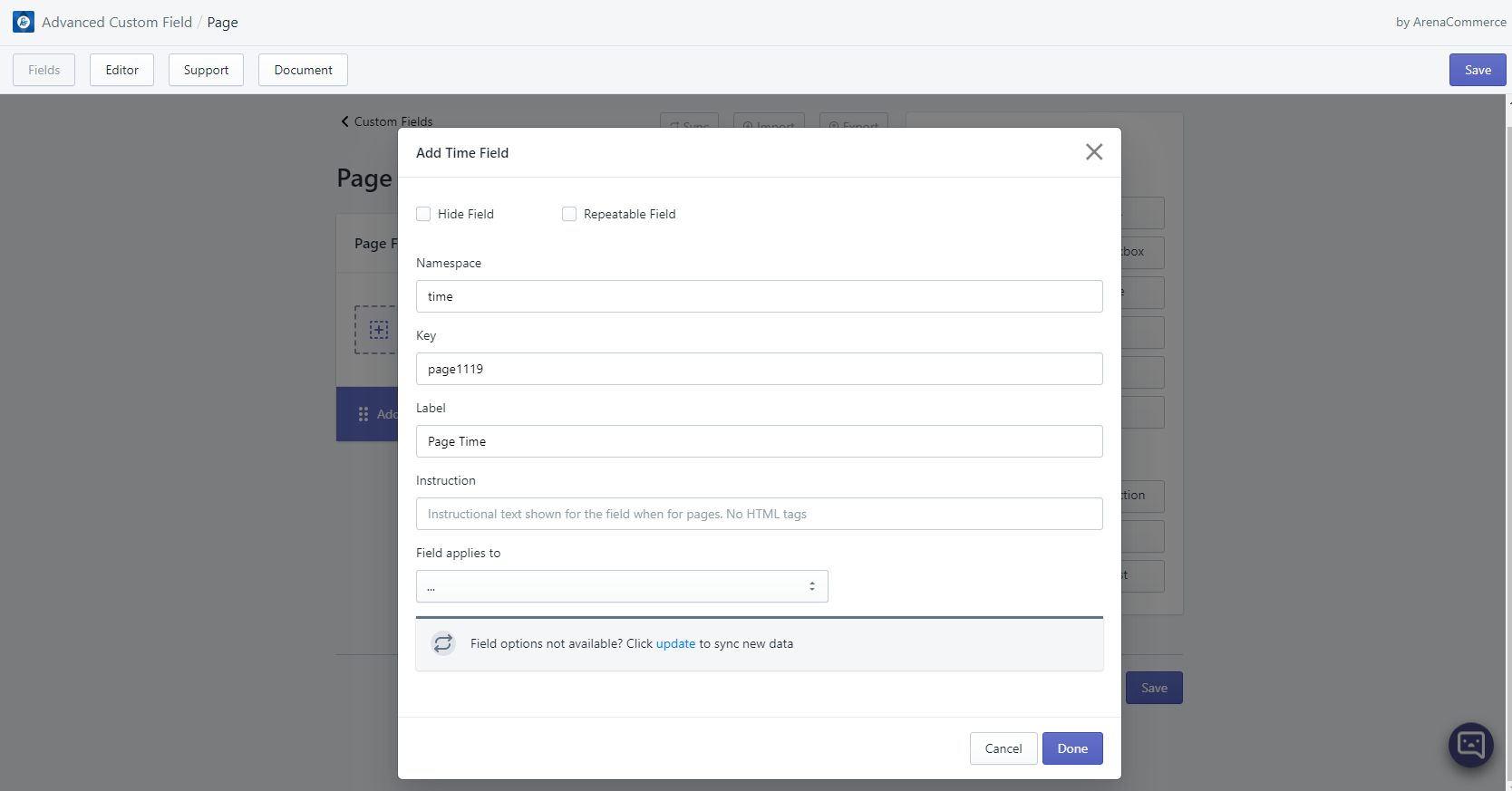
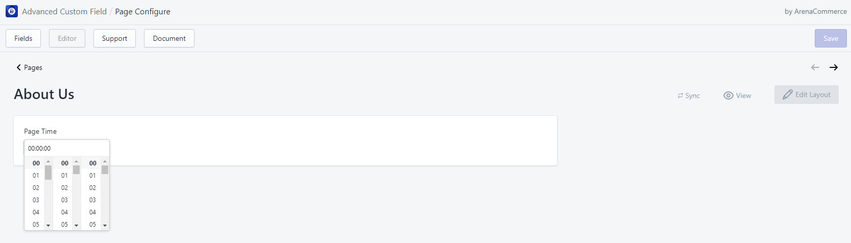
# 12. Time
- Time field allows users to set time for specific events, occasions, activities etc.
- Time field can be edited in Editor tab via time picker.
# 13. JSON
- JSON field allows users to add JSON content.
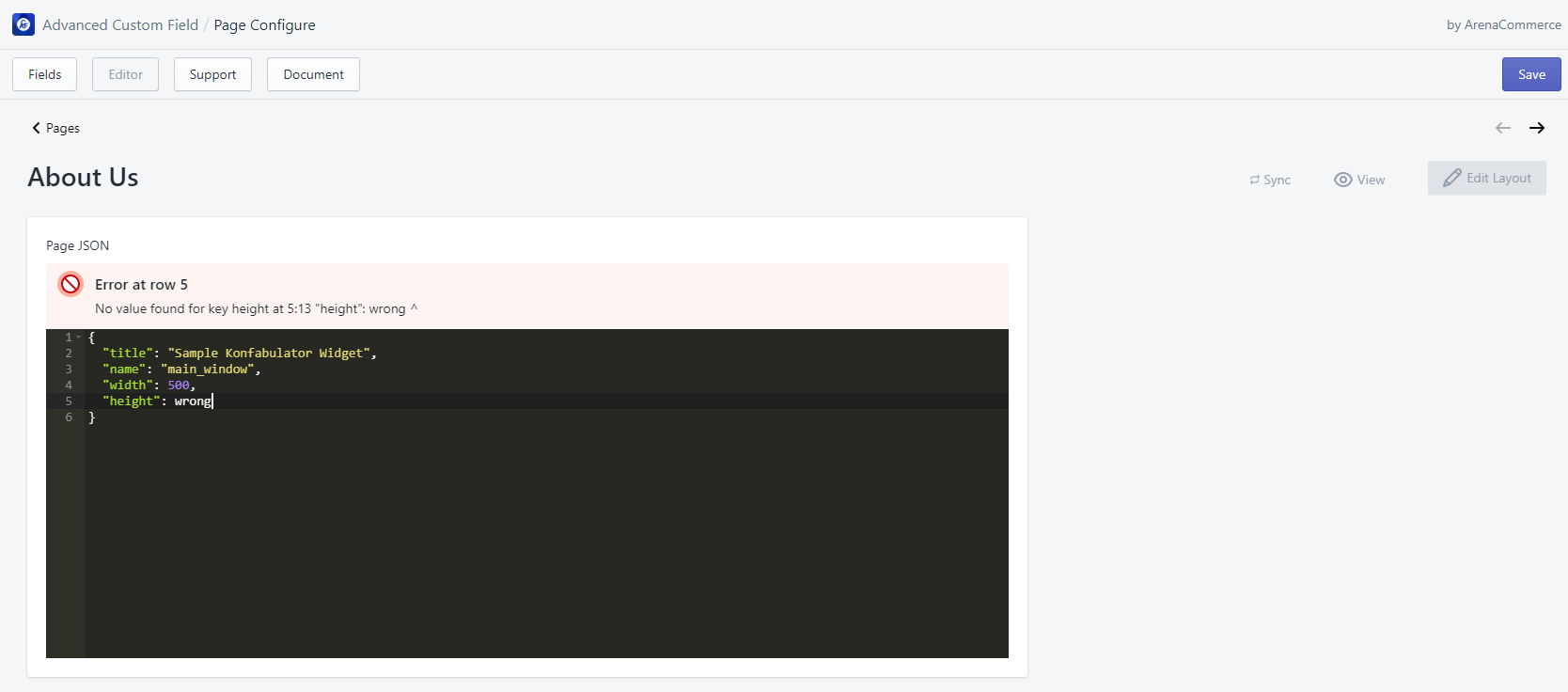
- JSON field can be edited in Editor tab via JSON editor.
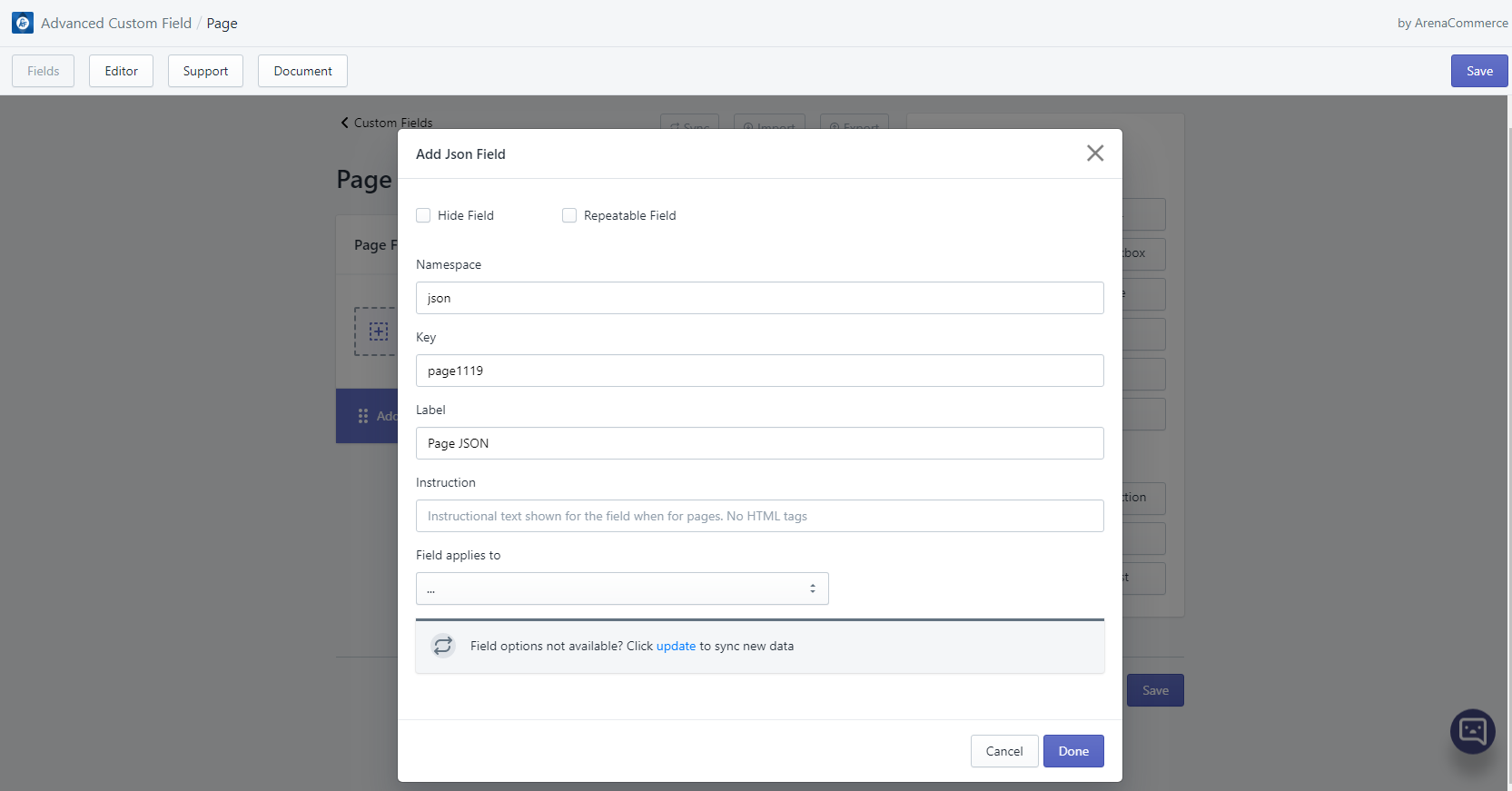
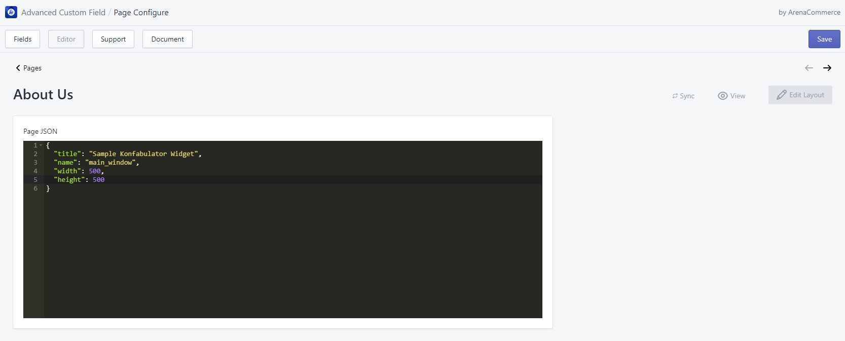
- Since it is a JSON editor, it can check JSON error while typing.
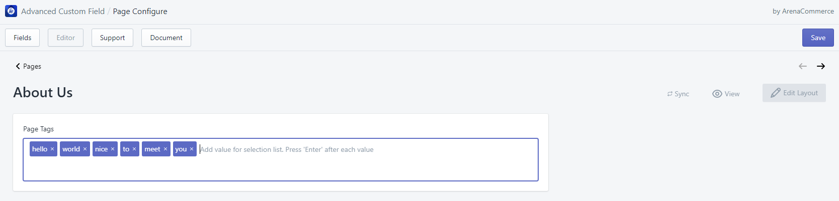
# 14. Tags
- Tags field allows users to add a list of tags.
- When attribute “Allow selection of multiple values” is checked, each value will be separated by |, for example: hello|world|2020, book|shoes|pen|eraser.
- Tags field can be edited in Editor tab via tag input field.